HIGHLIGHTS FROM Our FIRST 30 YEArs:
Hardware Store REBRAND
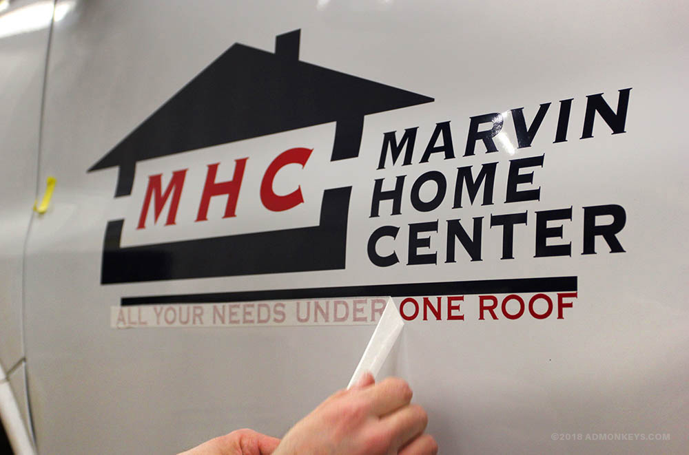
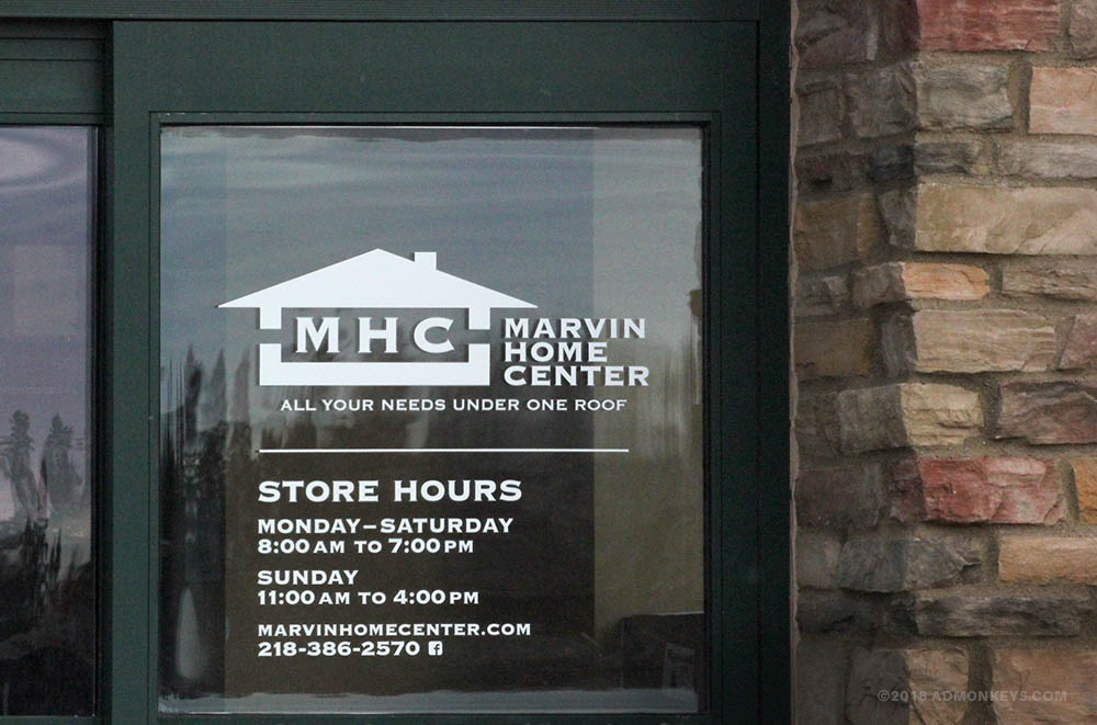
In 2017, Ad Monkeys was given the honor of updating the visual identity of a northern Minnesota hardware store. Known locally as Marvin Home Center, this Warroad retail store and lumber yard is actually part of the manufacturing giant Marvin Windows and Doors, or MARVIN® as it is known globally. For decades, the window manufacturer's familiar yellow rose icon remained separate from the hardware store's logo, which framed its deep red MHC initials inside a navy blue geometric house.

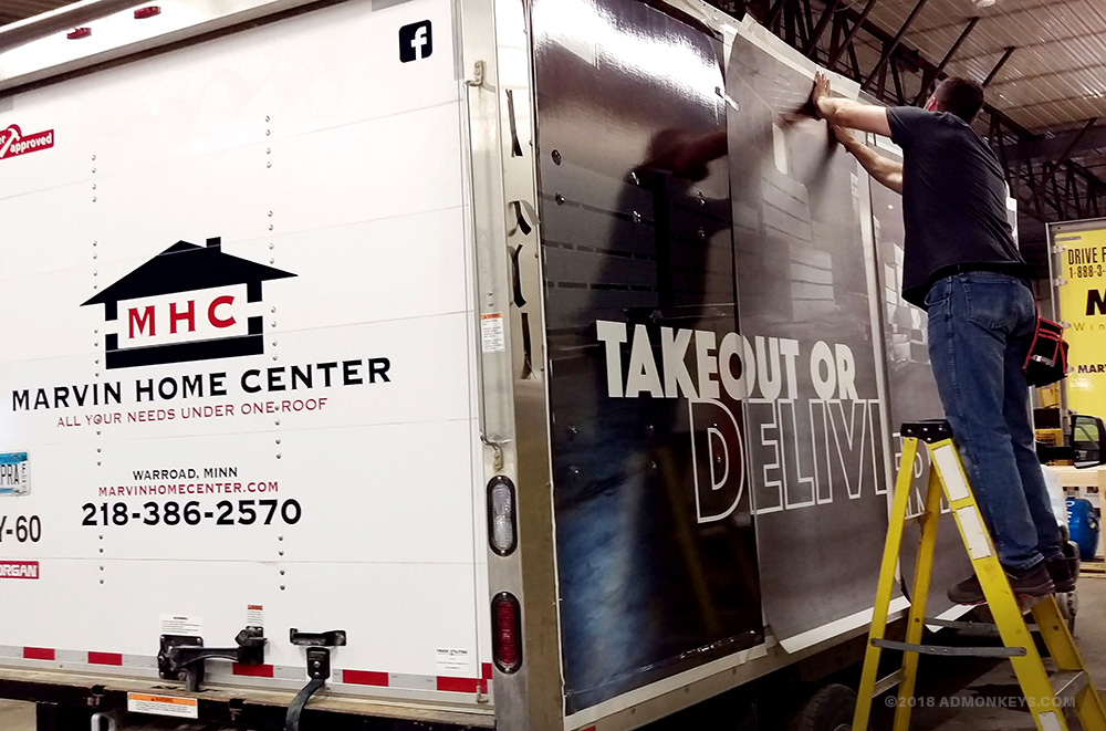
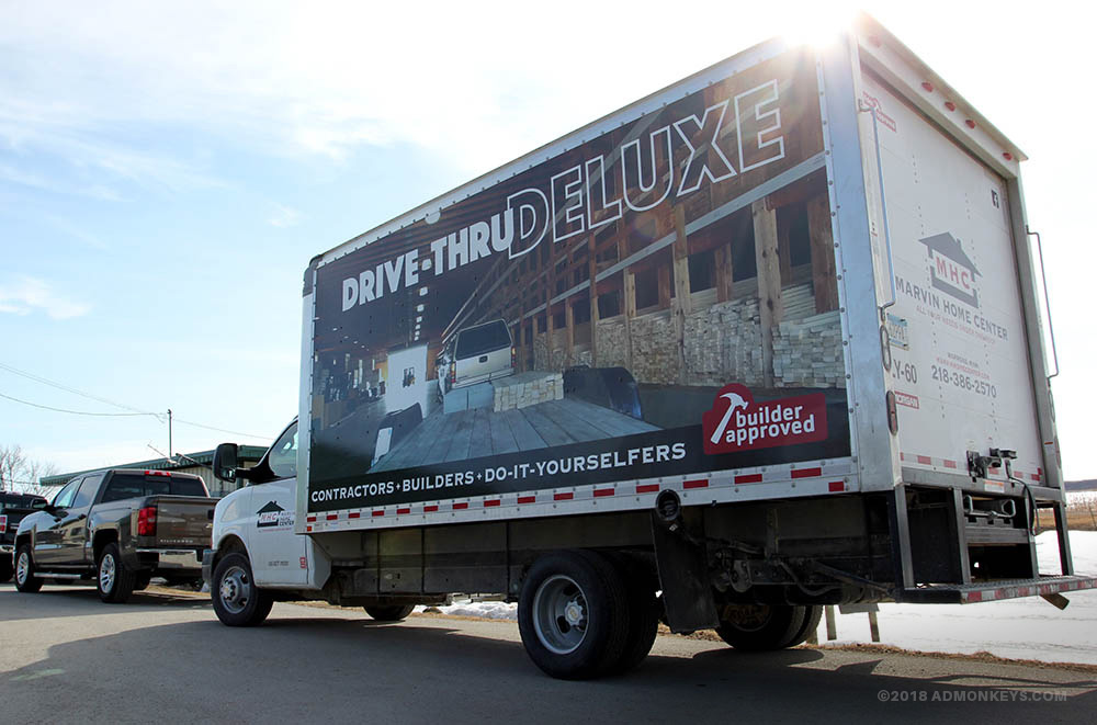
Rebranding of this MHC van included original Ad Monkeys photography, graphic design, and clever headlines.
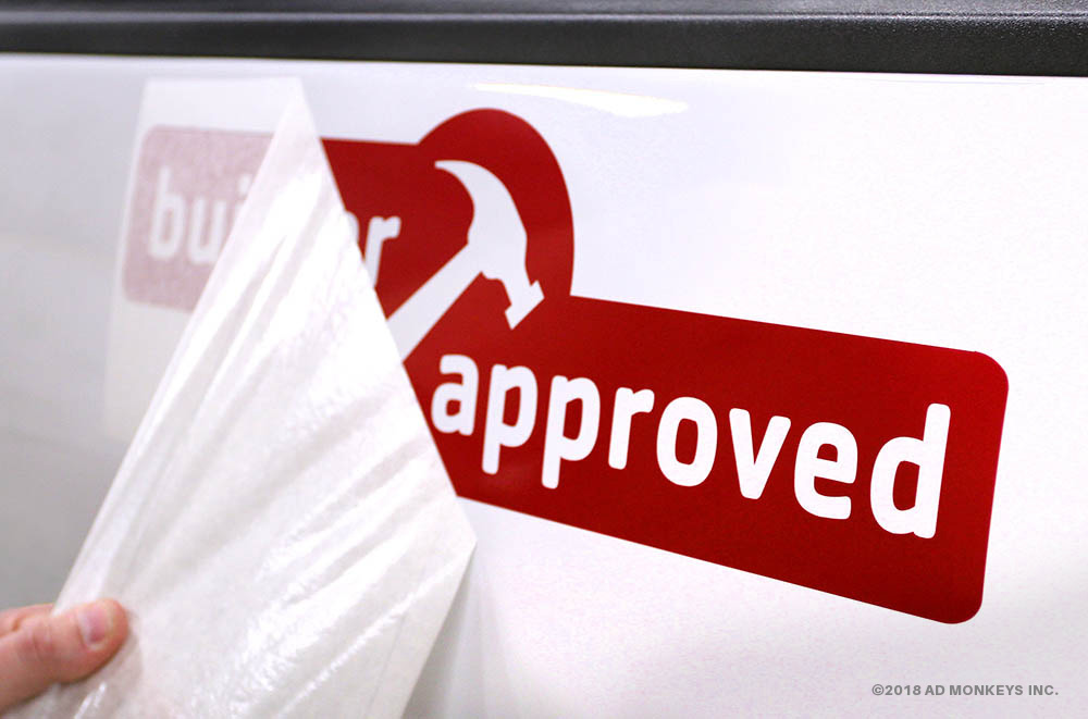
Over the next several months, Ad Monkeys introduced a refresh of the icon and more pronounced typography. We then prepared this new logo along with additional brand messaging and oversaw their installation onto the store’s fleet of step vans and delivery trucks. The new mark also rolled out across a variety of in-store branded content, employee apparel, and collateral materials — all which resulted in a clean and unique store identity.

Ad Monkeys turned this plain white cargo van into a traveling billboard as part of the rebranding of Marvin Home Center in 2017.
Ironically, a few years later, the Marvin company adopted a new branding strategy that pulled the store into the window manufacturer's main brand. This marked the end of the MHC house icon, but not before leaving its own indelible mark on Marvin Home Center and the community.
Photo Gallery


Like what you see?
We'd love to tell you more about this case study. Click that little orange button below to begin the conversation and discover how Ad Monkeys can produce a similar project for your organization!